Rip it up: the anarchic designs of punk and post punk
- Text by Miss Rosen
- Photography by Andrew Krivine

By the mid-’70s, music collector Andrew Krivine had gone off rock and roll. What had once embodied the revolutionary spirit of youth had become a bloated, pompous dinosaur raking profits for money-hungry music industry executives. Then, he found punk.
“For me, punk heralded a new era in rock music,” he says. “It had brevity, aggression and sonic velocity that spoke to me emotionally. It became my music.”
During the summer of 1977, Krivine travelled to London to visit his family. While there, he purchased the Clash’s debut LP, marking the start of what would become one of the world’s largest collections of punk ephemera.

DEAD KENNEDYS: 1 ‘Kill the Poor’ 45 front cover, Cherry Red Records (1980)
“I have always been a collector,” he says. “I am not sure if this activity reflects a compulsion to either impose order and depth over one subject, or to fill a void in my soul! But I can say that creating something tangible, enduring and definitive has been a gratifying journey.”
Now, some 700 pieces of memorabilia have been brought together in the new exhibition and book Too Fast to Live Too Young to Die: Punk and Post Punk Graphics 1976-1986 (Rizzoli) and limited edition (Rocket 88 Books).
“The major transformational aspect of punk was to allow freedom of expression separate from the increasingly homogenised design styles that were prevalent in the mainstream media and advertising of the late 1970s,” Krivine says.
“Nothing in punk design was new, except the attitude. But it was that attitude – iconoclastic, irreverent, rude and witty – which had a transformative effect on graphic design.”

THE CRAMPS: flyer for concert at CBGB’s, New York City, NY (24 May 1977), The Cramps design
Inspired by countercultural design movements of the past, a new generation of artists fused the political and surreal into a provocative mix, concocting a visual language as explosive and influential as the music itself.
Because of them, punk elements like stencils, collage, Day-Glo colours, rips, zippers, and razor blades have now become staples of mainstream design.
“Despite the nihilism and anti-materialism of the original punk scene – newspaper collages were the ultimate punk design because they recycled trash in aesthetic and form – the very idea of original punk artworks becoming collectable is incredibly ironic,” Krivine says.
“Punks believed that everything was worthless, that there was no future and so no point in making anything that might ‘last’. So, anything which has lasted from that period is rare – and rarity has a high worth. But the attitude of punk, that disruptive, dismissive, trickster-like, ironic, witty and inventive, sneering and political quality of punk design, is what matters most.”

BLONDIE: Plastic Letters LP poster, Chrysalis Records (1978)

RAMONES: Punk Magazine #3 (1977), signed by the band

Sex Pistols – 1975 signed JReid drawing of Steve Jones. SEX PISTOLS: flyer (c.1975), Jamie Reid design, signed by Reid

X-RAY SPEX: ‘Identity’ 45 banner poster, EMI Records (1978)

THE CLASH: Get Out of Control tour blank posters (November 1977), Sebastian Conran design (courtesy of Sebastian Conran)

Due to COVID-19, the exhibition Punk Graphics. Too Fast to Live to Young to Die. at ADAM – Brussells Design Museum will reopen at a later date. The limited-edition will be released by Rocket 88 during Summer 2020.
Follow Miss Rosen on Twitter.
Enjoyed this article? Like Huck on Facebook or follow us on Twitter.
Latest on Huck
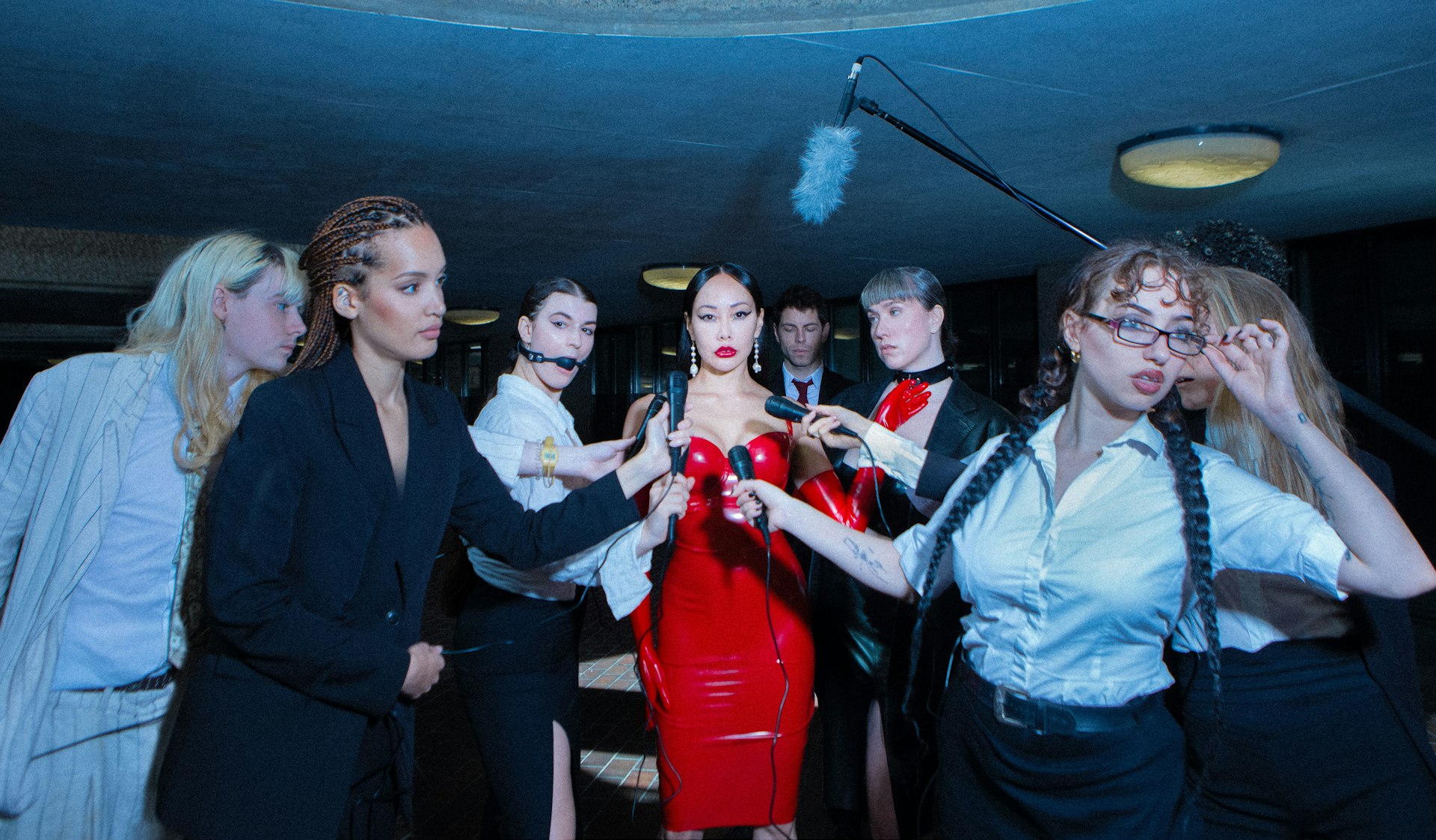
This erotic zine dismantles LGBTQ+ respectability politics
Zine Scene — Created by Megan Wallace and Jack Rowe, PULP is a new print publication that embraces the diverse and messy, yet pleasurable multitudes that sex and desire can take.
Written by: Isaac Muk

As Tbilisi’s famed nightclubs reawaken, a murky future awaits
Spaces Between the Beats — Since Georgia’s ruling party suspended plans for EU accession, protests have continued in the capital, with nightclubs shutting in solidarity. Victor Swezey reported on their New Year’s Eve reopening, finding a mix of anxiety, catharsis and defiance.
Written by: Victor Swezey
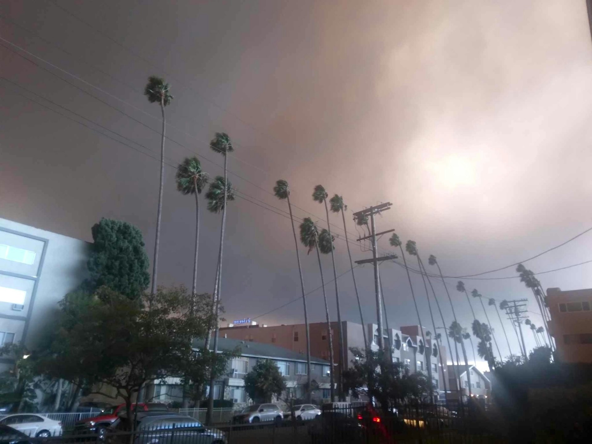
Los Angeles is burning: Rick Castro on fleeing his home once again
Braver New World — In 2020, the photographer fled the Bobcat Fire in San Bernardino to his East Hollywood home, sparking the inspiration for an unsettling photo series. Now, while preparing for its exhibition, he has had to leave once again, returning to the mountains.
Written by: Miss Rosen
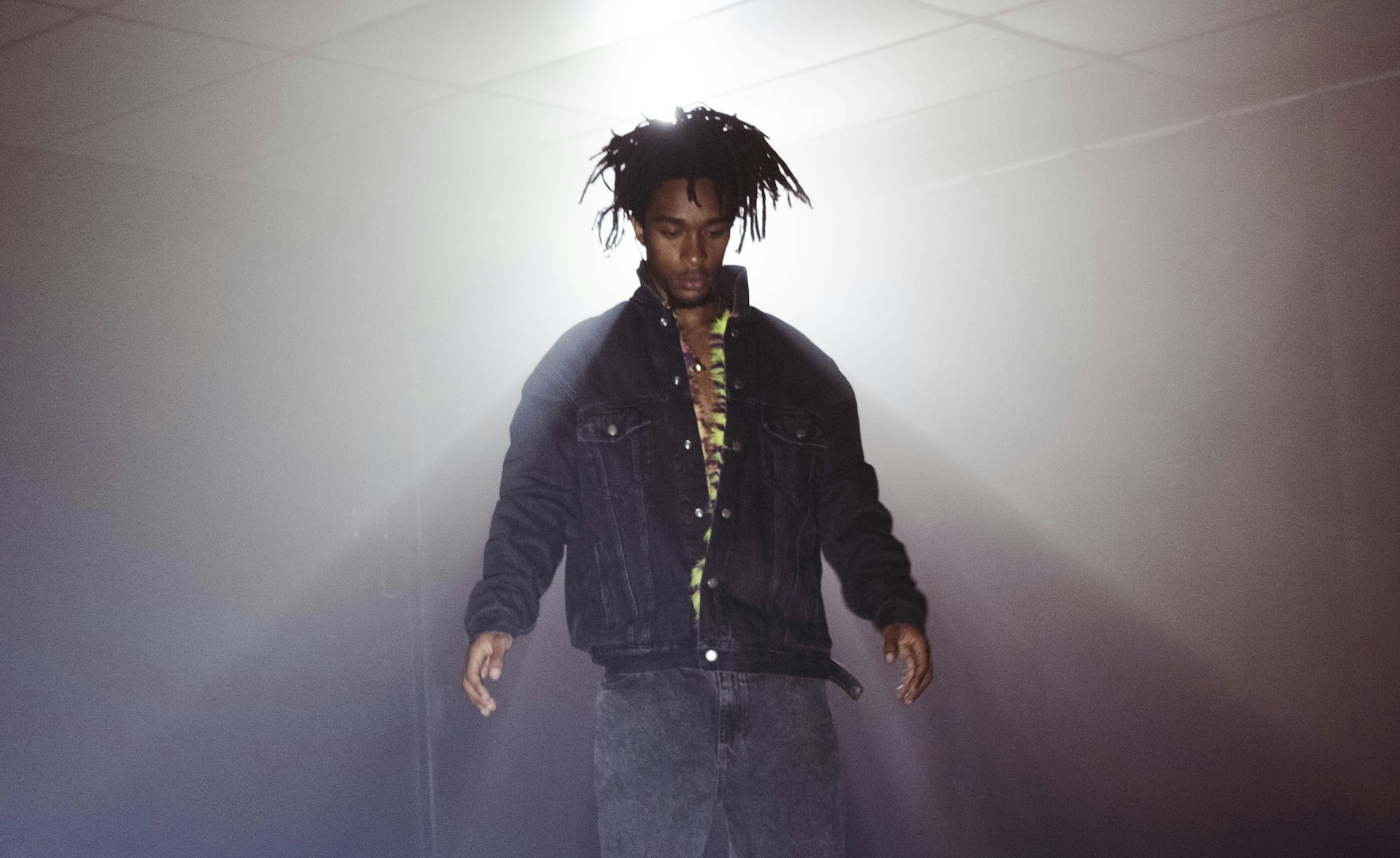
Ghais Guevara: “Rap is a pinnacle of our culture”
What Made Me — In our new series, we ask artists and rebels about the forces and experiences that have shaped who they are. First up, Philadelphian rap experimentalist Ghais Guevara.
Written by: Ghais Guevara
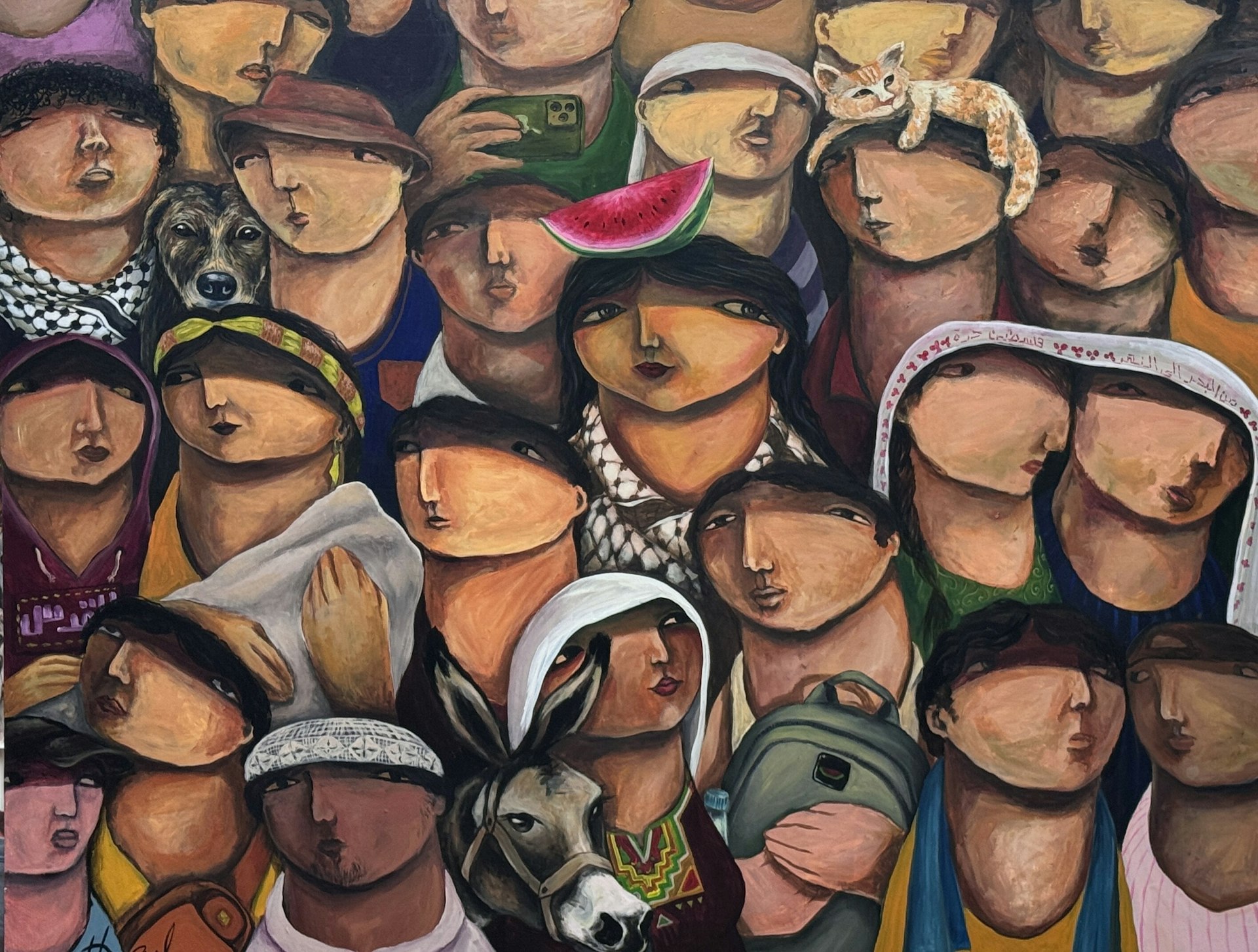
Gaza Biennale comes to London in ICA protest
Art and action — The global project, which presents the work of over 60 Palestinian artists, will be on view outside the art institution in protest of an exhibition funded by Bloomberg Philanthropies.
Written by: Cyna Mirzai

Ragnar Axelsson’s thawing vision of Arctic life
At the Edge of the World — For over four decades, the Icelandic photographer has been journeying to the tip of the earth and documenting its communities. A new exhibition dives into his archive.
Written by: Cyna Mirzai